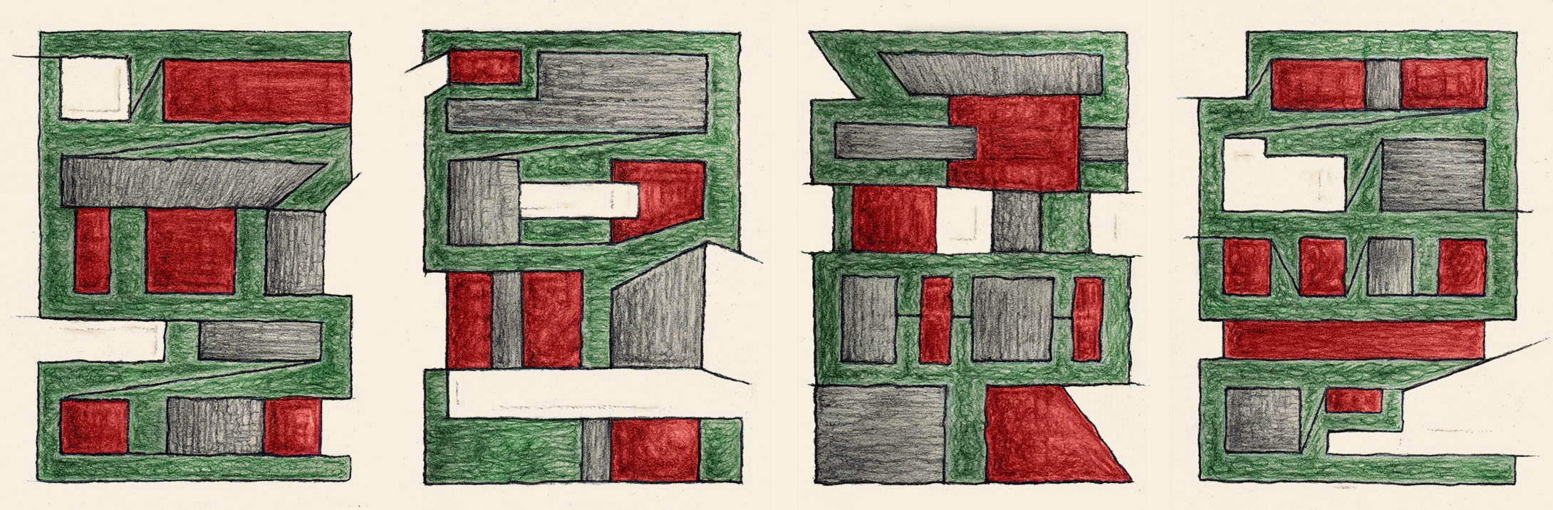
The tension between surface and depth is really interesting here. Seen side by side, the panels (pages?) seem like letters to me and the whole seems like a word. I don't know what word, but a colorful word. Taken together, all of these tensions (flatness/perspective, red/green, legibility/shape) make the piece seem to shimmer.
Love your comic. Wish I knew what it meant. To me it gives me a pleasure similar to looking at architecture. I love it. The green and red suggest 'craftsman' colors but the blockish shapes suggest buildings instead of homes. I like how they can be blocks, or buildings, or letters, or ...(I'm still seeing things) because it has this weird escheresque 3 dimensionality to it. I can't tell what's in front of what and I like it like that. I also love how I can rotate it all kinds of ways to see more stuff.
Thanks Chris! I planned to make this piece with just red and gray but when I was working on it, I saw something alive in there so I used the complimentary green.
 You can click on it to see the larger version or you can look at a 2x2 arrangement here.

it'd be nice to see these on a single page to be able to actually see the interconnections...
ReplyDeleteYeah, you're right - so now it's posted with the pages in a row.
ReplyDeleteThe tension between surface and depth is really interesting here. Seen side by side, the panels (pages?) seem like letters to me and the whole seems like a word. I don't know what word, but a colorful word. Taken together, all of these tensions (flatness/perspective, red/green, legibility/shape) make the piece seem to shimmer.
ReplyDeleteThanks Bungy! That is an interesting way of looking at it.
ReplyDeleteI've been making some typography-comic pieces lately (like this gig flier) so maybe that unintentionally carried over into this one.
i really like these works together, it seems like you keep losing your orientation in it and i like it when i can travel back and forth. Supercool.
ReplyDeleteThanks nina! On this particular comic I was thinking more abstract than usual in every sense, even regarding the sequence.
ReplyDeleteLove your comic. Wish I knew what it meant. To me it gives me a pleasure similar to looking at architecture. I love it. The green and red suggest 'craftsman' colors but the blockish shapes suggest buildings instead of homes. I like how they can be blocks, or buildings, or letters, or ...(I'm still seeing things) because it has this weird escheresque 3 dimensionality to it. I can't tell what's in front of what and I like it like that. I also love how I can rotate it all kinds of ways to see more stuff.
ReplyDeleteThanks Anonymous! That's a really enjoyable way of looking at it, to see new things as you look at it in different ways... Even I'm doing that.
ReplyDeleteGreat work Mike!I particularly like the color choices, really made my eye bounce around the page and look at it from many different angles
ReplyDeleteThanks Chris! I planned to make this piece with just red and gray but when I was working on it, I saw something alive in there so I used the complimentary green.
ReplyDelete