

Almost a year ago, I made two posts here on Ditko and Jack Burnley, respectively, where I showed some of their pages that, as the titles of the posts suggested, "might as well be abstract." To some extent, this is what I also did in my article on Ditko and abstract comics (in Smith and Duncan's Critical Approaches to Comics), where I discussed two other pages from Spider-Man that I'm sure readers of this blog are sick and tired of seeing. I've been meaning for a while to continue this series of posts on comics that, while representational, strike me as having some of the formal qualities that we see in abstract comics.
Now, the notion of representational comics "having some of the formal qualities that we see in abstract comics" may seem intuitively clear, though it might be a little hard to define. After all, on this very blog we have posted not only the images I mentioned, but also strips and pages by Kirby, Charles Schulz, and others (well, OK, here's even more Kirby), that somehow seem to belong in the company of abstract comics though they were made without any overt intent toward abstraction. The situation is really no different from an early 20th-century non-representational painter, say, finding abstract relationships of form and color in immediate or more distant, still representational, predecessors. While defenses of such maneuvers have been plenty in the last hundred years, perhaps the earliest full formulation of them can be found in Clive Bell's notion of "Significant Form":
What is this quality? What quality is shared by all objects that provoke our aesthetic emotions? What quality is common to Sta. Sophia and the windows at Chartres, Mexican sculpture, a Persian bowl, Chinese carpets, Giotto’s frescoes at Padua, and the masterpieces of Poussin, Piero della Francesca, and Cezanne? Only one answer seems possible — significant form. In each, lines and colours combined in a particular way, certain forms and relations of forms, stir our aesthetic emotions. These relations and combinations of lines and colours, these aesthetically moving forms, I call “Significant Form”; and “Significant Form” is the one quality common to all works of visual art. [from Art, 1914]If all art was defined by such relations of form and color, and not by representationality, then it was a small step from there for abstract artists to make art out of only form and color, and jettison representation altogether.
That said, each artform focused on--was abstracted into--qualities specific to its chosen medium, its particular formal characteristics. So, following up on this logic, Clement Greenberg could see modernist painting emphasizing and foregrounding flatness and the rectangularity of the frame, sculpture "volumetric quality," and so on. What about comics, then? In the article I mentioned I discussed two such specific qualities. The first one I termed "sequential dynamism," and defined there as "the formal energy, created by compositional and other elements internal to each panel and by the layout, that in a comic propels the reader’s eye from panel to panel and from page to page, and that imparts a sense of sustained or varied visual rhythms, sometimes along the predetermined left-to-right, top-to-bottom path of reading [in Western comics, I should have added; read "right-to-left" for manga], other times by creating alternate paths." The second term I proposed, borrowing it from the work of Werner Hofmann on multi-panel paintings, was "iconostasis," which, in the local context of comics studies, I defined as "the perception of the layout of a comics page as a unified composition."
While these formal qualities can be found in all kinds of comics, their presence and functioning are highlighted in abstract comics where, in the absence of a "plot" to move things from panel to panel, sequential dynamism is crucial to sequential progression; and in the absence of "represented" or diegetic time, the logic of panel-to-panel progression is primarily a formal one, traced across the surface of the page, rather than one in which the panels inhabit different fictional moments. I went on to suggest that, once abstract comics had isolated and foregrounded such formal characteristics, it was easier to discover them in comics of the non-abstract variety--in the same way, I argued, that it was only after the rise of abstraction that a painting by Raphael or Poussin could be conceptualized, no matter what else it was, as a flat field upon which shapes and colors are organized.
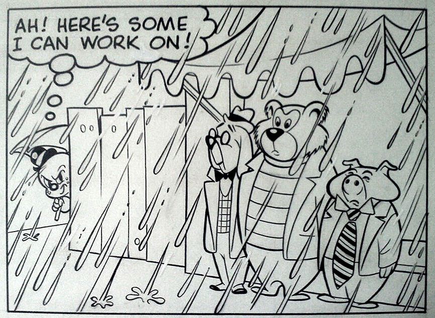
I'm bringing all this up to discuss the newest candidate I would propose for the "might as well be abstract" tag, namely the page below, from Casper the Friendly Ghost no. 25, 1954, featuring Casper's cousin, Spooky. It was drawn either by Steve Muffatti or Warren Kremer, or possibly penciled by Muffatti and inked by Kremer, or possibly, again, by another assistant of Muffatti's, probably one who also worked at the same time as an animator on the Casper cartoons (on the back of the original art board there are some sketches that are very clearly intended for animation storyboards). [EDIT: Since posting this, I have shown the page to Harvey comics specialist Leslie Cabarga, and according to him it's almost certainly by Kremer.]

As you can see, the page displays both of the formal characteristics I mentioned, and as a matter of fact they are both most clearly secured by the same graphic element, the wall of raindrops.The raindrops, pervasive in every panel, "iconostatically" unify the space of the page (other than the missing first panel, which would have been a pasted title). The falling rain gives the page an overall graphic texture that functions to some extent like the all-over quality that Clement Greenberg discussed in Abstract Expressionist painting, the purpose of which was also to unify the pictorial space of the canvas. (Of course, here the all-over also plays against the comics grid, which can remind us, perhaps, that the grid itself was another solution for pictorial-field unification in post-AbEx painting.)
The raindrops, through their directionality, also account for the strip's sequential dynamism: in the first panel, they fall down and to the left; in the last one, down and to the right, in the more "proper" direction of reading. This change already gives a kind of visual arc, or at least a sense of visual transformation, to the entire page. In between, they alternate (though not with strict regularity) between the two directions. Throughout, the downward motion continues to pull the viewer toward the conclusion of the strip and its visual "punchline" (it's interesting to note, in this context, that inasmuch as the strip does have such a punchline, it occurs in the next-to-last panel, turning the entire bottom tier into the concluding section), while the left-right toggling varies the visual reading experience and divides the eight-panel strip into clear sections, imposing a more complex rhythm over its panel-to-panel beat.
Already, I think, you might be able to imagine a sucessful (enough) abstract comic page made only out of those raindrops, perhaps in conjunction with the splashed water of panels 6 and 7. (If anyone feels like drawing that, by all means do so and I'll be happy to post it here. It would probably look rather like Grant Thomas's comics made by isolating the motion lines and emanata from manga.) I think it would be even more interesting, however, to look at how this abstract structure plays together with the strip's narrative content, and to what extent it enhances or illustrates that content (or whether--a question I have often asked--it is rather the narrative content that, to some extent, provides an excuse for the strip's abstract graphic play, a possible reversal I have compared to how the libretto provides an excuse of sorts, in opera, for the music). To do so, let's analyze the page one panel at a time.
Panel 1:

Well, here the comic strip starts, and to a good extent anything we can say of interest about this panel (in terms of our current concerns, at least) can only be said by comparison to the panels it's juxtaposed to. Notice how one's perception of it in isolation differs from the perception of it in the context of the page as a whole. The rain here is an anecdotal element, part of the narrative content. Looking at the overall page, however, it (also) becomes the unifying graphic texture I mentioned. Its directionality here is still only incidental, while in a wider (and, so to speak, synchronic) view of the page, it becomes a part of the strip's specific graphic rhythm, of its sequential dynamism.
Having said that, we can return already to the question of the relative predominance, or importance, of narrative versus abstract quality. The graphic texture of the page IS rain. In more ways than one: the texture is made up of raindrops, but also an iconostatic look lets us know from the get-go that the rain will not stop; the entire page is a portrayal of a day whose atmospheric texture, so to speak, is also rain. The strip functions like lyric poetry does for Walter Pater, who for this reason saw it as "the highest and most complete form of poetry": in it, "we are least able to detach the matter from the form." (This is from Pater's 1877 essay, "The School of Giorgione," which was perhaps the most important philosophical predecessor to Bell's essay.) Therefore, it is perhaps no longer a matter of predominance of one over the other, but of the sheer interpenetration of form and content, of the reciprocal embodiment of the two. I should add that, for Pater, this brought lyric poetry, as well as any art that achieved this inseparable interpenetration, "to the condition of music"--a notion to which my earlier mention of opera, as well as innumerable discussions of musical rhythmicality in comics, can easily be related.
Panel 2:

Spooky sets off in search of adventure. Notice how the raindrops have changed direction from panel 1. Here is a question to ask ourselves: diegetically, why is this happening? Are we supposed to think that the winds keep changing direction? This would seem the easiest explanation, which would imply that Spooky's trajectory is relatively linear, that there is a parallel, as there would be on a theater stage or in a cinematic left-to-right tracking shot, between the picture/page plane and the plane in which the action takes place. (Given the relative dearth of background, we could easily imagine this to be the case.) Or is it, rather, that Spooky's path is not linear, that it is it that changes direction in relation to the angle of the falling raindrops, and that we are thus following him deeper into diegetic space, not just going alongside him along a simple, planar axis?
Panel 3:

The raindrops, across the tier break, keep going in the same direction. They fill the panel with an all-over texture, and play against the semi-circles of the umbrellas. The creation of a varied visual rhythm from the repetition of the umbrella motif is, possibly unintentionally, reminiscent of Caillebotte:

or maybe of Renoir:

but there's something about this composition that equally reminds me of Hiroshige, with the clearer juxtaposition of the round umbrella (and, in Hiroshige, hat) shapes against the parallel lines of the falling rain:


...while the figures, cut off by and drifting off the frame, are quite reminiscent of some of Degas' pictorial procedures, such as in his Place de la Concorde:

The more irregular rhythm of the umbrellas, also going deeper into the picture plane, functions as a sort of counter-melody or visual counterpoint to the repeated motif of the rain, making for a more complex composition that also sets up and plays against the next "phrase" of the sequential melody, the transformations of panels 4 to 7.
Panel 4:
The raindrops change direction once again. In conjunction with Spooky's facing left now and clearly having come into the scene from the right, it also suggests--answering the question I asked above, when discussing panel 2--a traversal of the scene that is not simply parallel to the picture plane. Spooky's trajectory through the diegesis is clearly more complicated than might have seemed at first sight. Thus, the changes in rainfall direction, which unify but also give variation and sequential dynamism to the layout and thereby seem to function primarily on the surface of graphic inscription, on the picture plane, paradoxically also convey a move in depth, into a more complex intra-diegetic space. The tension between surface and depth, between two-dimensional design and three-dimensional fictional world, then, is a constitutive element of the page's aesthetic effect. We can, of course, again relate it to that interpenetration of form and content I brought up following Pater; with the caveat, or further qualification, that what we have here is not a simple melding of form and content into each other: the 2-D effect and 3-D reading intentionally diverge, only to further emphasize their interdependence, yet at the same time to maintain an unresolvable tension between them.
(Since I haven't done it yet, this might also be the place to remark on the subtleties of the inking, with depth of field secured by having thick-bordered shapes behind more thin-bordered ones, rather than the reverse, which is a more common procedure. The inking line is truly exquisite.)
Panel 5:

The direction of the raindrops stays the same across the tier break, as happened a tier above (makes sense, after all: if two-dimensional graphic variation is what is needed, why vary the direction between two panels that, though connected in time, are separated on the space of the page?). However, this time around it will also remain unchanged through next two panels. This way, the artist avoids imposing too repetitive a graphic rhythm on the page. However, this choice also has clear narrative implications. The setting remains the same from panel 4 to 7 (also thereby indicating retroactively that earlier changes of direction had nothing to do with variation in wind direction, say, but with changing angles of framing); and the four panels depict a continuous event, reaction immediately following upon action, effect flowing from cause. This becomes (as indicated by the raindrops), a unified sequence within the larger page, as opposed to the more discrete moments of panels 1-3. Interestingly, all the transitions on the page could be seen as "action to action," yet the ones in panels 4-7 are closer together (both in time and in logical consequence, causation) than the earlier ones--thereby indicating that Scott McCloud's categories of panel transitions may still be too rough, too approximate to help us understand much of the functioning of comics.
Notice also the pneumatic quality of the startled figures, the way they stretch up into ellipsoidal shapes like distorted rubber balls caught immediately post-bounce by high-speed cameras; notice the graphic quality of the sleeve of the figure on the far right as it rises and its fold points up, almost like an arrow, in the direction of the jump. All of these elements, and many more, add to the graphic dynamism of the panel, and such effects, in panel after panel, add up to the sequential dynamism of the page.
Panel 6:

As the figures bounce up and are partly hidden by amorphous or malleable elements (water, the cloth of the awning), much of the panel moves in the direction of abstraction, splashes, flung liquid. Is it a coincidence that this was drawn in or around New York, at the same time that Jackson Pollock was working?

(Don't answer that.)
The background--splashed water--moves forward and begins to join with the foreground wall of rain, continuing to play with the 2-D/3-D tension I've mentioned previously, with the relationship between surface design and diegetic space. The figures rise off the ground at the same angle as, but in the opposite direction of, the falling rain. From a pure design standpoint, they reinforce the main compositional axis of the panel, yet from the point of dynamism they introduce another tension, indicating that in a comic panel (and, yes, we can extrapolate that even to an abstract-comic one) it is not only static composition that matters formally, but, so to put it, composition plus implied movement.
Notice also the graphic rhythm of the flying group, the slight dip in the center (motivated narratively by the larger mass of the middle figure), the highest-rising (and, as we know from previous panels, the smallest) figure pushing toward the top-left corner of the panel, in its own way building upon the rainfall-axis, while the overall group of figures again, as did the umbrellas in panel 3, provides a visual counterpoint to--and behind--the falling raindrops. The scream of "A GHOST," strangely unpunctuated, is barely connected to the figures. It shows a kind of graphic independence that befits its extra-diegetic status (that is, as sound effect, it does not belong visually in the scene), and, puncturing the panel frame, it again reinforces the flat, design dimension of the panel.
Panel 7:

The mass of water on the collapsed awning pours forward, aligning itself even more closely with the wall of raindrops, curving down to join with it and splash in the same direction. The coming together of foreground and background, of surface and space, of design and diegesis, is almost complete, though the tension between the two will never be fully resolved. Amorphous, splashed shapes and the all-over texture of raindrops occupy even more of this panel's area, with the figuration reduced to a minimum (not to mention that ghosts, all ectoplasm as they are, are pretty amorphous and malleable, plastic, to begin with).
Panel 8:

The conclusion, and the last change in the direction of the raindrops. This change is multivalent: it continues the graphic variation in the layout; contrasted to the unchanging angle in the previous four panels, it indicates a longer passage of time than in the previous panel transitions; and it concludes the page with a graphic equivalent to the narrative denouement.
That last function can also be found in this one-pager by Beka (writer) and Crip (artist), from the recently published (in English) Dance Class, no. 2. (And if you're wondering how I found it, it's because my daughter, who is five--OK, five and a half, she'll have you know--and loves ballet, makes me buy it and read it to her. But enough about that.) We have the same depiction of rain falling throughout the page, and the punchline panel is distinguished from the others by a change in the direction of the raindrops:

Dance Class is a well-drawn and professionally done children's comic, and such a concluding flourish seems like a canny piece of craft. From that point of view, so is the conclusion of our Spooky page. Yet, there are a couple of differences, which make the page we're discussing here significantly more interesting. To begin with, as we have seen, it varies the direction of the raindrops repeatedly, giving it a more complex rhythm than the simpler one of the Dance Class strip, which mainly uses the change of direction for punctuation, to bring the anecdote to a close. (Also note that, to do so, it too changes the angle of framing--a change which is that much clearer than in the Spooky one, as the rendering of the setting is more detailed.)
The second difference is perhaps even more telling. Throughout the Dance Class strip, the rain falls down and to the right, emphasizing the direction of reading; the last panel stresses the conclusion by shifting to down and to the left and thereby arresting the forward impetus of the page, much like a returning tonic can stop the harmonic impetus of a piece of music. Yet "Spooky" does exactly the opposite: starting with a down-and-to-the-left motion, it devotes five of its eight panels to that direction that is partly counter to the direction of reading; and it ends on a panel where the direction of reading is reasserted, not arrested. Narratively, this seems appropriate in its own way, as it suggests that, not only did Spooky's plan not succeed this time, but that the story will ever repeat itself in other guises, and that Spooky (in his sad-sack persona, at least) just can't win and will never win. From a formal, more abstracted perspective, though, it also ends the page on a less decisive note, letting it glide to a close or, to use a different metaphor, fade away, rather than end on the kind of stronger tonic chord with which the Dance Class page concludes.
All this being said, let us look at the entire page again:
I'm not sure I have much more to add at this point to what I said in the introduction and in my panel-to-panel discussion. Just take, if you will, those individual readings, and re-integrate them in your reading of the page as a whole. No longer just moving from point in time to point in time, our gaze, when taking in the page iconostatically, glides over its surface, aware at all times of the spatial juxtaposition of the panels, of their participation in the layout's unified design. We see the raindrops' changes in direction; we see the apparent left-to-right movement of the title character, which becomes more complex as we realize that, diegetically, he is not moving along a simple plane, but traces a more complex trajectory through the fictional space; we see the interaction between the wall of rain, which becomes metonymic of the surface of the page, and the figures and objects behind it, more ensconced within the three-dimensionality of diegetic space; we see the near, though never fully accomplished, merging of the two levels; and the page itself becomes a kind of allegory, though perhaps somewhat of a skeptical one, for the interpenetration of form and content that Pater taught us about. Need I comment about how we happen to have found this not in a piece of soaring lyric poetry, as Pater would have expected us to, but in a comic, and not even in one made with any kind of visual-poetry, highfalutin intent, but in one coming from a solidly commercial, children-oriented milieu? I don't think so. Just look at the darn page.
.............................
(OK, one more thing. I realize that this post, or essay, may bring up more theoretical and methodological questions than it answers. To focus on just one, if it started in a theoretical context of pure formalism, "significant form," Clive Bell, Clement Greenberg, and Walter Pater, it ended, by focusing on the tensions inherent in the piece, somewhere closer to Paul de Man territory. I don't think that is necessarily a contradiction--deconstruction is a kind of formalism, after all, and more importantly, as a literary reading protocol, it was formed in the context of high modernism, of Jacques Derrida and Julia Kristeva reading Stéphane Mallarmé, and therefore there is a clear connection there, a genealogy. To bring that all up at the beginning of this essay would necessitate a thorough rewriting, more than I have the energy to do right now, though I will do so, probably, when integrating it in a more scholarly text; which I do plan to do. For now, I hope you put up with it as still a work in progress.)
First!
ReplyDeleteCute.
ReplyDeleteThanks, this is good! The left figure in panel 3 is interesting. Ignoring the rain storm which everybody else has to fight, he seems to use the umbrella as a shielding tool to keep himself in complete oblivion of the ghost rather than to prevent himself from getting wet.
ReplyDeleteI agree with the analysis of the elements, and there is an abstract comics layer over the underlying sequence. That said, I feel like the subject matter gets in the way for me. When thinking abstract art, there's an aesthetic experience from the design and the visual composition that is separate from representation. Here, the rain drops are visual shorthand. And the cartoony humor prevents the type of majesty that could be achieved by the interplay of line and direction. In the Kirby designs you had linked, the elements play together better. The abstraction represents space, movement, and the unknowable. It is imagination unbound, and is more powerful than the character art, which is fairly passive between the scenes. The characters move or twist through the larger abstraction, being secondary to it, and if anything, emphasizing its alien quality.
ReplyDeleteSo in short, I agree that these elements are also here, but prefer the Kirby approach.
Lutz--you're right, though I don't think it's intentionally meant to shield itself from the ghost. That kind of figure, drifting off the page and turned away from the action, was a favorite of Dan DeCarlo's--here's an example: http://4.bp.blogspot.com/-WEzx5-vobi8/T2M7UkvAyiI/AAAAAAAAVjU/-rT-c1Sgj34/s640/shes%2Bjosie%2B02.jpg
ReplyDeleteI guess it was used, basically, to extend the physical space, and also as a kind of repoussoir for the action, maybe?
Alexey, I know what you mean--the pleasure is perhaps more obvious with the Kirbys--but when I see what is supposed to be such a much simpler kind of comic, with no ambitions (or claims of artistic ambition normally made on its behalf by critics) function so formally, I just find it even more thrilling!
ReplyDelete