This interview was originally published on Catherine's now defunct site. I thought it was lost forever, but I recently found it here, where can also be found some other interviews with me and reviews of the anthology: http://roskofrenija.blogspot.com/2012/11/andrei-molotiu-antologija-apstraktnog.html
The images are gone but at least most of the captions remain. When I get a chance, if I can, I will put the images back in, but I wanted to make sure to post this as soon as possible.
...............
[Catherine Spaeth's introduction:]
Andrei Molotiu co-curated the recent show Silent Pictures , is the author of the recently published anthology Abstract Comics, and of the equally recent Nautilus, a collection of his own abstract sequential art. This Spring ArtLexis
held an exhibition of his work. Taken together Molotiu’s activity adds
up to something like a campaign for “abstract comics” as a new and
specific genre of contemporary art. In the interview below Andrei and
I discuss what might be considered the rules of the game.
Ibn al Rabin, The Empire Strikes Back
CS: You express
disinterest in equating the abstract comic with abstract animated film.
And so I am looking at this image, Ibn al Rabin's The Empire Strikes Back, and noting how very different it is than your own work in that it moves from frame to frame quite legibly within a narrative.
AM:
Well, yes, this kind of gradual transformation is one of the
“established” (if we can call it that) modes of abstract comics, and
people like Ibn al Rabin or Lewis Trondheim have done really fascinating
things with it; personally, however, I am interested in different kind
of effects in my own comics. Sometimes when you have only such gradual
transformation in an abstract comic you may almost feel like you are
dealing with storyboards for animation; the shapes go from point a to
point b to point c and give the illusion that you are following them
through time—though an abstract comic, by definition, cannot have a
sense of diegetic time (because no representation means no diegesis, no
fictional world in which time can have a meaning; because introducing a
sense of represented time implies moving away from the simple presence
of graphic events on a page). When you get a sense of represented time,
a sense of illusion seeps in, and the comic becomes almost like a time
graph, with the panels in the sequence showing events that take place
some set time interval apart. So there is something a bit paradoxical
about Ibn al Rabin’s comics, especially the ones in the book Cidre et schnapps,
from which this page comes. They have titles that suggest a diegesis, a
mimetic narrative, but on the other hand they are just blots on the
page enacting that narrative—perhaps allegorically? I think they work
better, for me at least, if you don’t give in to the mimetic temptation,
if you actually see them as blots on a page.
Andrei Molotiu, Realm of Coral in 24x24: A Vague Epic
To
see them as blots on a page also means, in a way, to see them as
simultaneous, and to realize that the perceived passage of time is a
construct, resulting from the visual juxtaposition of the panels. I
think it’s important—for abstract comics, and also for comics in
general—to not lose this sense of simultaneity, of the unity of the
layout, where you can see all the panels (on a page or a double page
spread) at once. If you do lose that sense, you end up conceiving a
comic as just a storyboard, and I think that does a disservice to the
potential of the medium; comics offer a complex reading structure that
suggests time differently than an actual time-bound reading or viewing
experience. You can contrast it to the reading of a (prose, as opposed
to graphic) novel, where the reader simply follows along a string of
words; and though many words do co-exist on a single page, you don’t
tend to think of their co-presence on the page as an aesthetic component
of the novel. Visual juxtaposition—and therefore, from one point of
view, simultaneity—is however an active aesthetic component of the comic
medium. One thing that is interesting to me about abstract comics is
exactly that they contain no preexisting narrative and therefore no
excuse for a sense of diegetic time. You’re not following a story, so
what you are left with are the actual visual elements on the page
(panels, shapes) that move your eye from panel to panel but outside of a
fictional time frame.
The other side of the equation is the
distinction between abstract comics and abstract painting. In the
Michael Fried/Clement Greenberg take on abstract painting you’re
supposed to take in the painting’s composition at once,
instantaneously. Well, abstract comics won’t let you do that either:
the juxtaposition of panels that suggests a kind of simultaneity
(therefore going beyond simple storyboard reading) at the same time
denies instantaneity: you can’t take in both the layout and each
individual panel at once, you have at least to keep transitioning from
one to the other, and from panel to panel in traditional reading order,
etc. So I think that comics work in between these two extremes, the
linearity of storyboards or prose, on one hand, and the instantaneity of
abstract painting, on the other. Rather they have more of a complex
tabularity, I guess, by which I means something like a table (say, the
table of elements), which contains both simultaneity and sequence. And
abstract comics, I believe, are especially well-placed to exploit this
complex structure. Does that make sense?
CS: Yes it does absolutely, I had a real appreciation for your use of Jackson Pollock’s piece in your anthology, recently in Third Mind,
but it appeared as an anecdotal aside and a failure if you will because
Jackson Pollock is doing “One” over and over and over again, very much
involved in that sense of an at-once-ness, and the painting by Jasper
Johns, Alley Oop, was a beautiful counterpoint to that. I’m going to quote what you say in an earlier interview:
“I think that, oftentimes, abstract comics do end up maintaining more
of that graphic energy, and I think that they can draw attention to this
very powerful tool in the vocabulary of comics that may have been lost
in a number of art and alternative comics.” It is almost an address to
action painting, only here most apparent through the lens of Jasper
Johns work, and what occurs in the Johns is an abstraction of narrative
as you move from left to right and frame to frame.
Jasper Johns, Alley Oop, 1958
AM: You're referring to my discussion of Pollock's
Red Painting 1-7, from 1950
. I
gave a talk at CUNY where I expanded on Jackson Pollock beyond what I
said in the introduction to the book. There is a Hans Namuth photograph
of his studio from 1951, in which you can see a number of his black and
white paintings that he painted side by side, on a single piece of
canvas, and that piece of canvas looks like nothing so much as an
abstract comic strip. Greenberg always discussed the importance of a
painting’s being aware of its edges, of the frame, but Pollock was doing
absolutely nothing of the kind; rather, he was just eyeballing it. He
would put about three different compositions on a single canvas,
sometimes side by side, in a row, sometimes in more complex arrangements
that look even more like abstract comics. The way they were originally
created they did not have the “instantaneity” or unity demanded by
Greenberg or Fried, the canvas was divided and you tended to focus on
one panel at a time, therefore needing time to explore the entire
piece. But usually he went on to cut them apart and then exhibit them
only one “panel,” so to speak, at a time. [I have, since the interview,
found a couple where he didn’t cut the panels apart, such as “
Number 7, 1951” and “
Untitled
(after CR # 328)”.] It’s interesting that his original impulse,
occasionally at least, seems to have been more towards this kind of
juxtaposition of compositions, because the side-by-sideness, if that’s a
word, was then completely negated in the cutting. From a Greenbergian
perspective such juxtaposition was unacceptable, because it fragmented
the overall composition, kept if from being unified. Furthermore, it
brought in a time element. The only [other] time he didn’t do that was
in
Red Painting 1-7, from 1950.
Jackson Pollock, Red Painting 1-7, 1950
I’ve loved Pollock for a long time, and
surprisingly enough—because most people think it’s his poorer work—I’ve
always been partial to his black and white paintings. I’m struck,
whenever I see them in a museum, by the pure phenomenological experience
of the dried black pigment stuck to the fibers. There’s such a
tremendous energy in those paintings, and one thing I’ve tried to do
(not always consciously, but I can see it in retrospect) has been to
recapture this energy and put in the service of what I call sequential
dynamism—the visual forces, in a comic, that can lead you across the
page from panel to panel and that in a way create a different kind of
frozen moment, one in addition to an action painting’s frozen movement
of the brushwork, the artist’s hand that moved across the surface of the
canvas. In abstract comics you have the additional movement of the
juxtaposition of panels, the suggestion of reading direction that is
given by the composition, the vectors of force in each panel. And when I
say “frozen,” it is because the abstract comic sits there, as any comic
does, waiting to be put into motion by the intention of the viewer, of
the reader, and also to put into motion the visual attention of the
viewer. Comics, so to speak, both are awoken by the viewer and they
awake the viewer’s gaze and sense of reading.
CS: I was fascinated
by the use of the word gutter to describe the space beteen frames and
the difference between paintings and comics and films is that in the
comic book the frame is in the picture and there’s something very
important about that. The frame being in the picture is somehow the
device that pulls in the attention of the viewer differently. An
abstract comic can be very decorative and full as though they were
all-over paintings in that about-to-become wallpaper sense of things.
But then you might notice that there is an almost palpable mobility of
the frames themselves. It makes me think of this toy by Dan Graham.
Dan Graham,
One, found
here.
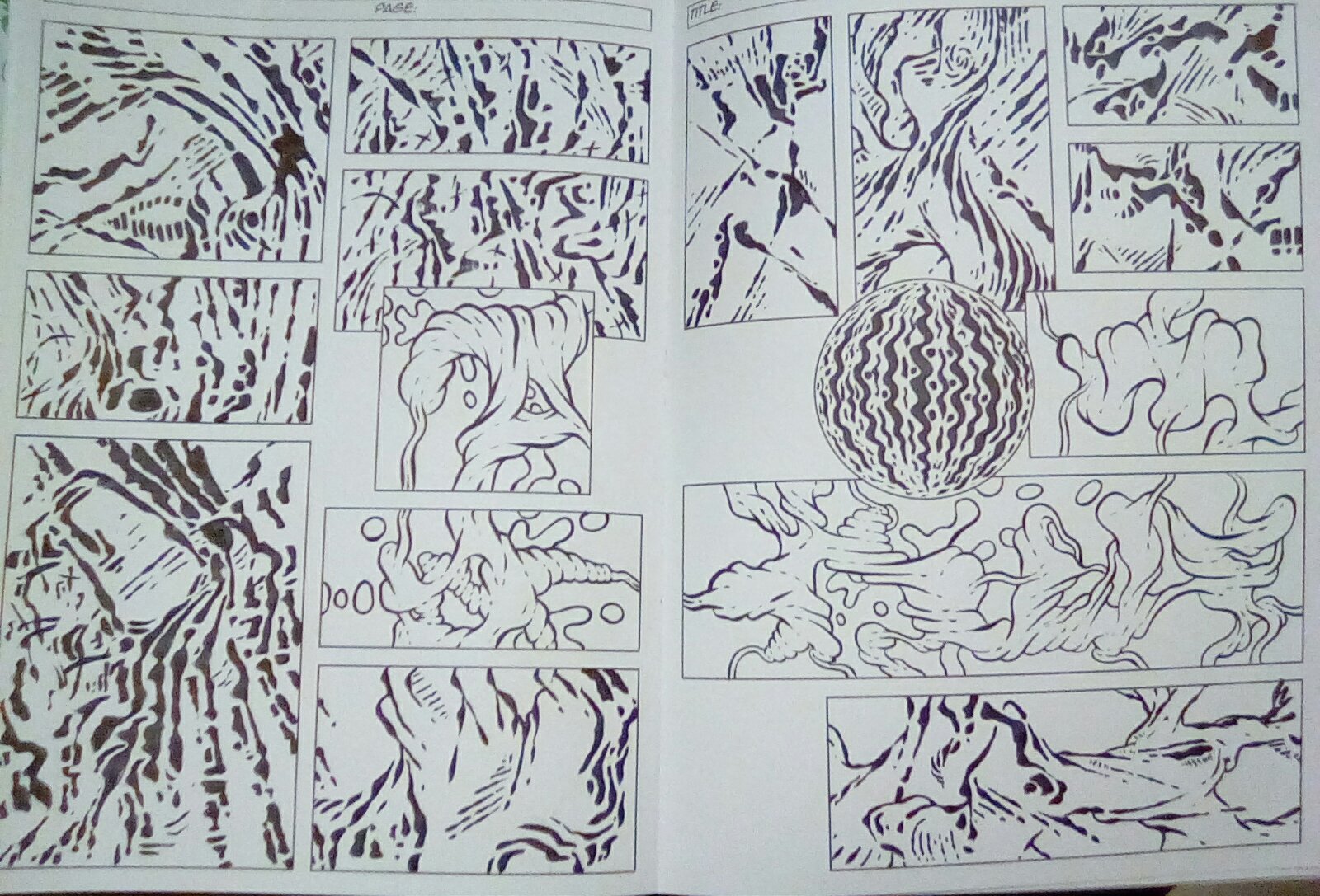
So this gets me to your exhibition at ArtLexis. The piece was called 24x2: A Vague Epic, and
as 24 pages on the wall it covered the gallery. Since it is available
as a folio, there was for me an interest in shuffling, in my agency as a
viewer being such that I could actually control the narrative. But in
fact what I learned was that even though these arrived as a folio of
loose sheets there was a very definite narrative in that they were
pinned to the wall from beginning to end. There’s not the sense of
agency and chance that I was at first invited to consider. Can you say
something about the kind of agency that interests you, as something that
is appearing from beginning to end in a deliberate way without giving
someone the agency to actually shuffle?
AM:
Well, generally with regard to abstract comics, I’ve been interested not
only in creating panel-to-panel sequentiality, but also in placing
within each one of my pieces some kind of “narrative” arc, such as one
that might lead from a low-key beginning to higher intensity and then
ending low-key again. Not all abstract comics need to do this; for
example, the pieces in the anthology by Richard Hahn don't really do
this, they exhibit more of a pulse and rhythm that vibrates from panel
to panel, a movement in and out of the picture plane, but no arc per
se. But personally I’ve always been interested in the possibility of
still maintaining such an arc—let’s call it a “sequential arc,” maybe,
like a narrative arc but within abstract form. At the same time, in 24x24
in addition to this arc I was concerned with the unity of the layouts,
so in a way each page in that series forms a kind of hybrid picture that
can be read both as a unified layout with a grid imposed upon it and as
a sequential arc.
Andrei Molotiu, 24x24: A Vague Epic, installation view at Artlexis, 2009.
I should add that the
pages were created sequentially. They were laid out panel by panel, one
at a time, and the unified composition only appears out of the
juxtaposition of those sequential images. I only realized this was
going to be a series after I’d made the first three or four, and then I
said to myself, ok it has to be a series of twenty-four because that is
(more or less) the traditional number of pages in a comic book story,
and also because there were twenty-four panels in each strip. In this
series, probably more than I’ve done in other pieces, I started to put
more or less descriptive titles on each page that somewhat took them
beyond pure abstraction, as for example happens in—and this has always
been a huge influence on me—Jackson Pollock’s Full Fathom Five.
Once you contemplate the meaning of the title you begin thinking of
space in the sea, you begin thinking of coral, of seaweed, and therefore
it is not purely abstract, it becomes an underwater space. Obviously
not a perspectival space, but a space where everything is afloat at
every level; and such a “floating” space, if you will, itself tends to
become abstract inasmuch as it differs from the box space of the
Renaissance, where everything is weighed down to the ground.
As I began giving the pages titles, more or less akin to Pollock’s
Full Fathom Five,
I realized that I was actually toying with images that were right on
the threshold of legibility—right beneath it, perhaps but which could
suggest to people this or that kind of representational shape. I was
reading recently a review in
The New Yorker,
of the new Kandinsky show, and the reviewer said he could never enjoy
this one painting by Kandinsky because he always sees a football helmet
in it; and there’s also the story of Braque telling Picasso that he
could see a squirrel in one of his cubist paintings, and Picasso
basically going off and destroying his painting by trying to get rid of
the squirrel. But I don’t mind when people find such representational
elements in my pieces, especially in my
24 x 24 pages—as long
as this recognition remains vague and uncertain, more along the lines of
a Rorshach blot. I actually enjoy it when people interpret these
abstract shapes as figurative elements, even though they were not
intended as such. Anyway, to make a long story short, I found that
adding the title gave a kind of direction to the interpretation of the
piece, structured the viewer’s experience as to what he or she might
find in it; and when arranging the piece as a print series, with each
plate printed in a different color ink, I found that color suggested a
mood for that reading. I found myself trying to give the entire series
the feel of a barely remembered film from one’s childhood, like
The Empire Strikes Back,
which I haven’t watched since I was twelve but still remember fondly
(funny, I wasn't even thinking of Ibn al Rabin's piece when I came up
with this notion!). Trying to recall that movie, I don’t remember
anything but my sensations, and tremendously vague memories of the
imagery, mostly moods. So, in a way, with
24 x 24 I was trying
to suggest in the present moment that vagueness of memory (through the
vagueness of abstraction in which one nevertheless may be able to find
some figurative shapes, and through the titles, which almost work like
chapter headings for some DVD of a long-forgotten epic film), the memory
of a story more as a sequence of moods than of events—and that’s why I
called it a “vague epic.” Admittedly, “vague” is also my own bilingual
pun, coming from Stéphane Mallarmé, my favorite poet (you can find my
translation of his
Afternoon of a Faun here.) Mallarmé was always interested in an effect of vagueness in poetry, but for him vagueness,
le vague, also related to the notion of the wave,
la vague.
Same word, different genders. (And clearly, waves relate to my
underwater imagery.) Mallarmé is probably my greatest influence, when
he talks about the music underneath poetry. For him surface meaning in
poetry was only necessary so that poets don’t get stoned—I mean
attacked, reviled—by the public. The true meaning of poetry is the
abstract music under the words. In the same way, I’ve been trying to
get at the music underneath the images, the graphic music that underlies
sequential art.
CS:
This is what I like
about the introduction of that piece by Jasper Johns, and I was thinking
very much of abstraction as a sort of unconscious moving through the
narrative. I can tell you from a viewer’s experience what your work
looked like in the gallery: My initial response was that this is very
cool, as in that register of cool as opposed to hot. The gutter is now
literally the wall, the abstraction is very decorative, and it took
time. The colors became cues, spotting the wall as a kind of
punctuation in time. For someone literally standing in the middle of
the room and looking at everything from the distance, slowly - and I
haven't yet even reached the point where I understand that there is a
beginning and an end - I’m beginning to see what the gutter is doing -
that it is in a very literal way creating a discretion between one
thing and the next. I then began to see that there are different
topographies, each page was giving me a view that was really quite
specific, there are even different angles of viewing. It became clear
that there wasn’t an homogenous space from one page to the next that had
been simply sliced apart. This was not immediately evident but
gradually evident. So the way that you’re talking abut the epic as
something that can belong to a childhood memory, that earning of one’s
way past some field and into another where sensations are evoked and
specific but not articulated as though they belong to ... well in this
case the fall guy is narrative but we don’t even need narrative anymore
at this point. And it’s only after this point that I understand enough
to ask the question “Can these be shuffled around?” can I arrange them
at whim?, and there’s a clear narrative I’m told. It’s not until that
point that I go up to them and I read the titles. I am moving around
the room, checking back and forth, trying to ascertain with effort some
sort of meaning that I’m being guided towards which ultimately fails. I
don’t know if anyone has ever told you what it was like to look at that
hanging in the gallery. AM: I’m tremendously
grateful to you for telling me all this. In many ways that’s how I
wished it to be read. I don’t want to say you were “correct,” but it
confirms that I was able to create them in such a way so as to convey
the experience that I’d had myself and that I was trying to convey.
[image]
You mentioned Jasper Johns, and I hadn’t
quite put this together before now—but I think there is a connection
between what I do in
24 x 24 and what Jasper Johns did in his painting
Alley Oop. There, Johns pasted a Sunday
Alley Oop
page to his canvas and covered it with just blotches of paint, blotting
out the representational details but leaving in the larger shapes, so
that abstraction is revealed as a kind of unconscious of the
representation—he draws out the vagueness, the abstract wave of shapes
that’s underneath the narrative of the
Alley Oop story. This is close to what I was trying to do in
24x24 and more generally in my abstract comics. One of my favorite comic artists is
Jack Kirby,
who did a great amount of comics from the ‘40s through the ‘80s. You
can see a transformation of his work around the mid-sixties, and I
believe that at the time he is beginning to learn form Lichtenstein,
noticing the powerful abstraction of form had always been there in his
own work but becoming more and more self-conscious about it. Especially
in 1965 to 1975, his work becomes so graphically powerful and
intentional, and I find myself enjoying it not so much for the
storylines but for the unconscious abstraction underneath the story,
that gives the story its graphic weight. In a way, in
24x24 or in my piece
Expedition to the Interior
I’m almost providing for the reader’s conscious experience something
that I experience, in other comics, as the unconscious. Of course,
abstract painting itself was trying to do that, with Kandinsky already
trying to provide harmonious compositions, like he had seen in earlier
art, but without the distraction of representational form. But abstract
comics do this for sequential art.
Andrei Molotiu, Expedition to the Interior
CS: This is really what
made me interested in Stanley Cavell and his thoughts about automatism.
He’s talking about film but he’s interested in the camera, and the
relation film has to what he refers to as the photograph’s automatism.
In The World Viewed,
published in 1971, he’s describing film as being in a situation in which
it hasn’t realized itself as a medium, and that it’s become a way in
which we look out at the world and we hide behind ourselves as we do
so.
AM: What does he mean by that?
CS:
He says, and here is literally the passage: “Our condition has become
one in which our natural mode of perception is to view, feeling unseen.
We don’t so much look at the world as we look out at it from behind the
self. It is our fantasies, now all completely thwarted and out of hand
which are unseen and which must be kept unseen.”* Film hides us in the
dark, as it were. And so he wants to fight for film’s potential, for
film to fully realize itself as a medium, by leaving this place where we
look out at the world from behind the self.
AM: So it’s referring simply to the notion of film as a voyeuristic medium, where the body of the viewer is hidden?
CS:
Yes, and so he comes upon this word automatism as a way of, you were
talking about energies as moving from frame to frame, and he’s speaking
of medium-specificity as having this unconscious automatism, and of not
being given a priori: “one might say that the task is no longer to
produce an instance of an art but a new medium within it... The failure
to establish a medium is a new depth, and absoluteness, of artistic
failure.” He continues, “In calling such things automatism's I do not
mean that they automatically insure artistic success or death but in
mastering a tradition one masters the range of automatism's on which the
tradition maintains itself, and in deploying them one’s work is assured
a place in that tradition.” Because of your own resistance to film and
interest in the dynamic sequentiality of the comic I’m drawn to the
sense of this word “automatism” as a way of understanding the dynamics
of the medium, which is now a growing international scene of abstract
comics. You’ve shown that it is only the conditions of visibility, what
I’m pointing to as automatisms that are already visible in the medium,
which have to do with what you were referring to as their graphic
energy. Cavell is putting pressure on film and narrative and still,
much in the way that you want to be resistant ...
AM: I would have to go
back to Cavell’s text for a full understanding of what he means by
“automatism,” but one thing we might be saying here may have to do with
the subconscious ways of reading or scanning the page that are involved
in taking in any comic—does that approach “automatism” in the way you
are using it?
CS: Yes, and it is true that I
may be pushing the word a little bit closer to you than it actually is.
Another thing I can’t help think about is the little conversation we
had about Bergson’s Matter and Memory, you were actually thinking of this quite seriously before you embarked on Abstract Comics.
AM: Yes, I have something on
Bergson
that was published in a web journal, actually, a good while ago. If we
are going to gather everything that I’ve done and look at what it has
to do with abstract comics, let me go back quickly and say that I did
study with Stanley Cavell. I was half film and half studio-art major
(fortunately they were in the same department), and there was an active
debate between my film-studies advisor, Vlada Petric, the curator of the
Harvard film archive at the time, and Cavell. Petric was always
concerned with identifying the specifically “cinematic” in cinema,
declaring some films not at all cinematic, inasmuch as they didn’t do
anything interesting with editing, camera angles, what have you. I’m
sure this influenced my notion of sequential art, wanting comics do more
than simply represent, narrate. But, on the other hand, Cavell’s
response was that the moment you put something in front of a camera and
film it, transferring an image of reality onto celluloid, it becomes
automatically cinematic; and so the debate was between the cinematic as a
kind of active intentional quality put into the piece by the artist,
and the cinematic as a preexisting condition of the medium itself.
Within comics such automatism may relate to the pre-set structures of
reading—from top to bottom, left to right—which already create a kind of
pre-existing dynamic of reading; but the visual experience of the comic
can be enhanced through the more active, intentional introduction of
sequential dynamism—which I suppose would correspond to Petric’s notion
of the cinematic.
Andrei Molotiu, 24x24: A Vague Epic, installation view
CS: Are the new
pieces in which you are thinking of animation, is that a new step for
you or have you been thinking about it for a long time?
AM: That goes back to
having done film and animation back in college. When I was 15, 16, like
everybody else I wanted to direct, to be a film-maker, but in college,
after having studied both film and studio, when having to make a choice
for my senior thesis I decided to go to studio. But I’ve always felt
caught between the two. More immediately, my recent flirtation with
animation started a couple of months ago when I simply couldn’t settle
on a color scheme for a comic I had created, and so I decided, why not
just try all colors, shift the color continuously? I thought I
remembered Photoshop has some animation capabilities, and it took me
about half an hour to figure out how it works. So, for that piece
Flow,
I made the colors shift from top left to bottom right—enhancing the
direction of reading a comic—looping through the entire color spectrum.
When I finished it I thought that’s kind of cool, the design itself can
stay put but the colors can shift, and I thought that’s the only way
for an abstract comic to contain animation and yet still remain a comic,
not become animation. Then a Finnish visual poet who had found our
abstract comics blog back in April and discovered the notion of Abstract
Comics, she’s done a lot of them since, Satu Kaikkonen, posted a blog
entry saying she wanted to try animated abstract comics too, partially
because she found what I had done unsatisfactory, too limited. That got
me thinking about how far the notion of animated comics could go. This
is a debate not only in abstract comics, by the way, but even in
mainstream comics, you see some web comics from Marvel or DC containing
limited animation—and critics say that then they stop being comics at
all. The question, for me, is whether one can maintain the abstract
relationships of shape to shape, from panel to panel, across the comic’s
grid, once you’ve added movement inside the grid. If you add movement,
is it still a comic? To some extent I’m not sure it is. The thing
about comics is that still images create the illusion of dynamic
movement, so the moment you put an actual, time-based movement within
each previously static image, within each panel, it works against that
illusion of movement, that sequential dynamism born out of still images
which I see as the essence of comics—or at least of abstract comics.
Nevertheless, in some way I wanted to explore the edge between comics
and animation, and to some extent I don’t see this as a major direction
but a brief exploration; I’m not sure how far I will go into it, because
I really think of abstract comics, pure comics, as the main field I
want to explore. But I think also having done all these abstract comics
I needed a break, to clear my mind for a while. My most recent,
For Bruce Conner,
is the one I’m happiest with. Yes, it is inspired by Bruce Conner’s
films but even more immediately inspired by Bruce Conner’s drawings,
which I’ve been utterly bowled over by—for example the little ink
drawing hanging as a scroll in the Third Mind show, which was absolutely
one of the most beautiful things I’d ever seen (the tiny reproduction
of it in the catalog is disastrously small and conveys nothing of its
effect). So the animation that I made started from a hand-drawn remix
that I had done about half a year ago of a Bruce Conner drawing, and it
somehow felt appropriate to animate it. I ended up cutting it up into
quarters and arranging it in four panels, and having each panel loop
through an animation cycle, so that it’s both static and dynamic, and
each cycle is a slightly different length. The movement in each panel
is from the top left to the bottom right, again to emphasize the
direction reading of a comic, but because they have different cycles the
overall composition of the four-panel piece changes gradually, as the
four panels start in sync, fall out of sync, then take a very long time
to fall back into sync—so that almost at no moment is the composition
ever the same. So I like the idea of a combination of the grid
structure of an abstract comic with movement, it becomes a kind of
hybrid medium, but I still think the animation makes it a unified image
more than a comic where you would read the panels in order, 1,2,3,4. On
the other hand I’ve found that, if I force myself to impose that
sequential reading, and, say, look at panel one for the duration of a
cycle, then shift to panel two and—if it’s halfway through a cycle—I
wait for a new cycle to begin and then watch that entire cycle, then
move on to panel three and so on, it is quite satisfying. It does weird
things to one’s sense of rhythm.
CS: I’m interested in how the animation is in
relation to the gutter and you mentioned that you were going to the
edges. What came up for me (and this is very opportunistic) is that in
JStor you can type up a name to see what happens and so I typed up Bruce
Conner as I was interested in the fact that you had chosen his work as
the vehicle with which you would step in to this new form - a
questionable form you’re saying. What came up was a pretty interesting
short little essay from October called “Observations on the
Long Take,” by Pierre Paolo Pasolini. He’s interested it seems in Bruce
Conner as someone who is really involved in montage and what it is that
montage does.** Here’s a nice little passage, "The language of action
is thus the language of non-symbolic signs in the present tense; but in
the present it makes no sense, and if it does, it does so only
subjectively, and in an incomplete and mysterious way." He is
interested in montage as opposed to the long take in that it is the cut
as the ending that produces meaning. I’m interested in thinking of these
abstract comics - and I’m coming at this from an art-historical
perspective, I don’t know anything about comic books, I never even read
them! - But I’m really interested in the fact that the page of the comic
book has frames that appear as the picturing. And it is not neutral in
that it even has a name, and that the gutter is actively producing
meaning. I like very much that Pasolini was thinking about the language
of action as a language of non-symbolic signs and what it means to cut
into that...
AM: As I said, I was also a film studies major, and
this goes back to the basic debate between the long take and montage,
between André Bazin and Eisenstein. For Eisenstein the meaning of film
comes from the cut, the edit. Bazin was more focused on the long take,
and clearly this inspired the debate I mentioned earlier between Petric
and Cavell (Bazin, like Cavell, was more interested in the
phenomenology of film photography, which is better expressed in the long
take); but in terms of the drawn medium of comics, there is a very
close parallel between the way meaning arises between the panels, in the
gutter, and the way that Eisenstein discussed the notion of the edit.
Eisenstein started from a notion of dialectics—well, dialectical
materialism, as he was supposed to say under the Soviet regime—and for
him there was a dialectical relationship between the two shots united by
a cut, with the resulting meaning being greater than the sum of the two
parts. This is not really different from what Scott McCloud discusses,
in his book
Understanding Comics,
with his notion of closure. For McCloud, comics are inevitably
fragmented, but as we read them we effect this closure from panel to
panel that makes us perceive continuity across each gutter, when in fact
there is no continuity, there is only a cut. Sometimes closure can be
achieved very easily, automatically, such as in what McCloud calls
moment-to-moment transitions. On the other hand, there are transitions
where closure is not so automatic, such as when two completely different
things happen in the two panels, and you are the one who has to put the
two things together, to find the continuity. The best example that
McCloud gives—and the subject may seem rather cliché, maybe because he
is so imbued with traditional comic-book narrative or maybe because he
is doing it ironically—shows in the first panel a man yielding an axe,
screaming “I’m going to kill you” as he chases another fellow; in the
second panel all you see is a cityscape with a scream sound-effect
rising over it. We automatically assume that the second panel is
occuring immediately after the first, and the scream rising over the
cityscape is the scream of the person who was killed by the axe
murderer. But clearly a lot of assumptions on the part of the reader
play a role in this act of closure, in order to unify the narrative—as
McCloud says, it is the reader who decides to let the axe drop. To go
back to abstract comics, this has been very useful for me to realize
that abstract comics did not have to work only in the gradual
transformation—apparently “moment-to-moment”—way we discussed earlier,
when we were talking about the work of, say, Ibn al Rabin. Clearly the
closure is effected there very easily. But in many of my comics I avoid
such a gradual transformation and like to juxtapose images where you
cannot see a clear transition the one to the other—but you are, ideally,
effecting the closure abstractly. I guess I’m proposing that closure
does not necessarily need story, representation, to function. It’s more
like getting two very different sound events that still make sense
rhythmically or even melodically, one after the other.
Erasing Dreamland, by Mark Charles Brown, 2006
CS: The interest in Bruce Conners is very specific
in supporting what you said, and the background is that the film alluded
to by Pasolini is Report, a film of Kennedy being shot. What
I was noticing in the Mark Charles Brown's interpretation of Conners
[above] is a similar but filmic interest in what happens when different
frames are cutting into the movement of a scene.
AM: Well what it reminds me of is Abel Gance’s Napoleon,
1927 or so. The movie is mostly projected with only one projector, but
in the final sequence all of a sudden two more projectors kick in, and
the screen goes from being the traditional 3:4 ratio to a 1:4 ratio, an
incredibly wide screen. In this final sequence—the conquest of
Italy—the three screens sometimes are synchronized, sometimes are out of
sync, and it becomes an amazing visual experience, an ecstasy of
imagery. It’s done with tinted film, and to celebrate Napoleon’s
victory the left screen becomes tinted blue, the right red, transforming
into the French flag itself.
Abel Gance,
Napoleon, found
here.
An effect of this is that it makes you
aware of film as a spectacle presented to you while you are in the
auditorium, as oppposed to allowing you to be a voyeur, in the dark, and
sucking you into the diegesis of the film. When you have only one
screen you get one diegesis to be sucked into, but having three side by
side you are too aware of the spectacle of projection to remain simply a
voyeur. I guess you get the same thing from Nam June Paik’s
installations—many TVs at the same time function very differently than
the fascination of a single one—or from Christian Marclay’s pieces with
three or four side by side screens, with montages of different music
clips.
CS: What happens when the shift is
made as it has been from the frame by frame appearance of the comic book
as it appears on a page, and a page that is going to be turned - which
is a very specific thing - and referring to this thing called the gutter
as what appears between each page when it is pinned to the wall?AM:
Well, beyond the gutter you have two more things in any comic, you have
the little valley in the spine between two pages (is there a word for
that?) and the rhythm of page to page turning, which is a very powerful
tool in comics. Artists who have made longer abstract comics have taken
into account the experience of the viewer upon turning the pages, not
only from the point of view of shifting from one page to the next, but
also knowing the impact of a shape or graphic event being on the
right-hand or left-hand page, on the verso or recto. For the anthology I
asked the contributors whether they wanted their piece to start on the
left-hand side or the right-hand side, and most had clear preferences.
This effect, this dimension is also currently used in conventional
comics—for example in a superhero story you might have the big reveal of
the villain as you turn the page, and therefore you get a kind of
visceral experience of this revelation. Clearly this effect is not
quite possible in an exhibition, because if you put the pages side by
side on the wall you don’t get the experience of turning the page. The
difference between a book experience and a wall experience, if I may say
so, is if I may that a wall experience is a second-degree tabular
experience—that is, not only are the panels side-by-side in the space of
the page, but the pages are side-by-side in the space of the wall. On
the other hand, this way on the wall you get a second degree gutter, so
to speak, which for me becomes quite powerful, but in a different way.
This issue—book versus wall—has been to some extent debated in the
notion, and the movement, of gallery comics spearheaded by the artist
Christian Hill, who has pushed for comics made specifically for the
gallery. In the show, when we placed Patrick McDonnell’s pages on the
wall, side by side, their compositions seemed to move up and down across
the pages, almost in a wave. If you step back and see the whole comic
at once you can get the feeling of the narrative arc in one glance, and
then you can step closer and read it frame by frame.
Going back
to our discussion of my animation, it would be interesting to begin
questioning the use of the gutter in cinema and animation. We were
drawing an equivalence between the comic book’s gutter and the film’s
cut, when discussing Eisenstein and McCloud, but if you project two or
more reels side by side, you really get a double gutter, in a way a
gutter in space and one in time, and that deserves to be more explored.
CS: I would like for posterity’s sake to ask you about the show that was at MoMA, Comic Abstraction. You were just describing a real ambition to exhibit comics in a gallery context... AM:
What was funny about the show is that I was working on my Abstract
Comics book when I learned that MoMA was doing a show called
Comic Abstraction
and I thought “Oh my god, I’m being scooped!” But their focus turned
out to be really quite the opposite of mine, because abstract comics is
about a series of juxtaposed abstract images, while
Comic Abstraction
turned out to be concerned with traditionally unified abstract
works—paintings, mostly—which happened to contain rendering elements
derived from comics. The only piece that might have had some overlap was
by
Rivane Neuenschwander.
She colored in the pages of an old Uncle Scrooge comic, maintaining the
panels and graphic rhythm of color from panel to panel, together with
the empty word balloons. But overall they are two very distinct
movements. My concern about the
Comic Abstraction show at MoMA is that it continued the logic of their 1990
High/Low
show, which is basicaly a logic of high art’s appropriation of popular,
and supposedly anonymous, culture. To some extent, MoMA still seems to
be able to enshrine “popular culture” only when it has been
appropriated in high art. There was a good example of this in the
Comic Abstraction
catalog (which I don’t happen to have on hand right now), in the entry
for an artist who made large murals by copying explosions from a comic
book. The catalog showed the comic-book panel that had been copied, but
only labeled it as the source for the painter’s imagery, giving it no
other credits whatsoever. Clearly it was from a recent comic, written
and drawn and inked and colored by somebody—by people who have names.
The panel must have been scanned from the actual comic, so they could
have easily found the names of its creators. Not labeling it as
anything but a (apparently anonymous) source for the mural denies the
agency of the comic artists, and suggests that such lowly imagery is
only given merit through its appropriation in “high” art.
CS:
It’s a curator’s sensibility to appropriate in such a way. As you
began talking I had this strong reaction to the manner of appropriating,
and thinking of Jasper Johns’s painting and how important Leo
Steinberg’s essay “Other Criteria” was, or is for me, in finding another
way to talk about early Pop Art paintings as flatbed picture
planes.*** I like very much your efforts in all of this to have some
integrity about what is actually visible in a medium, and this is what I
was trying to get at with regard to automatism. AM:
The overall tendency in what I am doing is completely to ignore high
and low hierarchies, and to realize that powerful formal developments
have arisen with as much creative agency at every level of culture.
Jack Kirby is as important for me as Jackson Pollock, and I draw no
distinction between the two in the way that MoMA, for example, might.
Jack Kirby,
Thor,
found
here.
* Stanley Cavell, "Automatism," in
The World Viewed, Harvard University press, c. 1971, pp. 101-108.
** Pier Paolo Pasolini, Norman MacAfee and Craig Owens, "Observations on the Long Take,"
October, V. 13, Summer 1980, pp. 3-6.
*** Leo Steinberg, "Other Criteria," published in
Other Criteria, University of Chicago Press, c. 1972.
Catherine Spaeth, c. 2009