
I wrote on Steve Ditko's connection to abstraction in the introduction to Abstract Comics, and so has Ken Parille in a great article on Blog Flume. (Go read Ken's article now, then come back here. Go, go! I'll wait.) So I was pretty excited when I saw a new post at Comics Comics, by AC contributor and blog member Jason Miles, post that at first glance (I should stop reading so rashly!) I thought continued the discussion in the same direction. However, after my first enthusiastic comment there, Jason explained that his intention had been to show how Ditko's layouts serve the narrative. Had I read his post a bit more carefully, I would have noticed this in his original text too, for example when he praises Ditko's techniques for being "respectfully appropriate to the story"--and, consequently, I wouldn't have been so quick to comment there that I agree with him. So this is a post about why I disagree.
Showing posts sorted by relevance for query ditko. Sort by date Show all posts
Showing posts sorted by relevance for query ditko. Sort by date Show all posts
Thursday, January 21, 2010

Friday, February 5, 2010


Sunday, January 31, 2010
Instrumental music, abstract comics, and the logic of illustration
(Part III of a multi-part series. Mild warning: this is a pretty academic post, primarily of interest to some of the people who have commented on my earlier Miller and Ditko posts. Feel free to skip it if you're not into that kind of talk. The next installment--the next two, come to think of it, there's no way I can do it in one--will be on Ditko's "Spider-Man." You may want to come back for those ones...)
Anyway. In the last couple of posts I have been using quite a few musical analogies, and it's time I addressed that issue head-on. I think I first brought up (in writing, at least) the musical parallel in a post on the old TCJ Message Board (Comics Medium, "New Abstract Comics" thread, p. 2, June 12, 2004, 10:53 PM; yes, I realize that thread died along with that entire board, which I think is a huge shame. This was one of the couple of threads from it I saved, and I wish now I had saved a lot more.) In response to a comic that our own Mike Getsiv had posted, I wrote:
Anyway. In the last couple of posts I have been using quite a few musical analogies, and it's time I addressed that issue head-on. I think I first brought up (in writing, at least) the musical parallel in a post on the old TCJ Message Board (Comics Medium, "New Abstract Comics" thread, p. 2, June 12, 2004, 10:53 PM; yes, I realize that thread died along with that entire board, which I think is a huge shame. This was one of the couple of threads from it I saved, and I wish now I had saved a lot more.) In response to a comic that our own Mike Getsiv had posted, I wrote:
Saturday, November 12, 2011
Spidey and Ab Cmx, and a couple of other announcements
Some of you may remember my old monster post on Ditko's Spider-Man of almost two years ago, and how I promised there would be a second part to it. Well, that second part mutated into a proper scholarly article, "Abstract Form: Sequential Dynamism and Iconostasis in Abstract Comics and in Steve Ditko's Amazing Spider-Man," which is now available in Matt Smith and Randy Duncan's new edited volume, Critical Approaches to Comics: Theories and Methods. Please check it out if you get a chance.

Also, I have some abstract comics coming out in periodicals: in the Canadian literary journal, Carousel, in the Yugoslavian comics journal Stripolis (actually, they came out in Stripolis no. 2, earlier this year, but I haven't seen a copy yet), and in the Swedish anthology C'est Bon, I guess in issue 13. Having already been published in Swiss, Portuguese, and Australian anthologies, I guess this is all part of my project of world domination...
Also, I have some abstract comics coming out in periodicals: in the Canadian literary journal, Carousel, in the Yugoslavian comics journal Stripolis (actually, they came out in Stripolis no. 2, earlier this year, but I haven't seen a copy yet), and in the Swedish anthology C'est Bon, I guess in issue 13. Having already been published in Swiss, Portuguese, and Australian anthologies, I guess this is all part of my project of world domination...
Wednesday, September 17, 2014
Intercorstal for Offlife

I've been a fan of Off Life comic for a while now -- they release collections of short comics from mostly-UK based creators. The style of the comics the run with is absolutely nothing like what I make, but I thought I'd give it a punt anyway, and repurposed the layout from a Ditko Amazing Spider-man (which Andrei reliably informs me is Ditko's best page, which I genuinely didn't know beforehand).
To make it a slightly better fit, I put some diary-comic style words together -- details of that can be found on my personal blog about the whole thing: http://garethahopkins.blogspot.co.uk/2014/09/submission-to-offlife-10.html
But here it is, in its raw form (other than bumping the layers and cropping, obviously).
Friday, July 10, 2009
Ditko's Abstract Comics

I saw this great post over at Blog Flume about the beautiful abstractions in Steve Ditko's comics. These panels are just begging to be remixed into a full abstract comic! (HT: Paul Hornschemeier)
Thursday, January 24, 2013
Might as well be abstract, part 3
[NOTE: this is still a work in progress. See notice at the end]

Almost a year ago, I made two posts here on Ditko and Jack Burnley, respectively, where I showed some of their pages that, as the titles of the posts suggested, "might as well be abstract." To some extent, this is what I also did in my article on Ditko and abstract comics (in Smith and Duncan's Critical Approaches to Comics), where I discussed two other pages from Spider-Man that I'm sure readers of this blog are sick and tired of seeing. I've been meaning for a while to continue this series of posts on comics that, while representational, strike me as having some of the formal qualities that we see in abstract comics.

Almost a year ago, I made two posts here on Ditko and Jack Burnley, respectively, where I showed some of their pages that, as the titles of the posts suggested, "might as well be abstract." To some extent, this is what I also did in my article on Ditko and abstract comics (in Smith and Duncan's Critical Approaches to Comics), where I discussed two other pages from Spider-Man that I'm sure readers of this blog are sick and tired of seeing. I've been meaning for a while to continue this series of posts on comics that, while representational, strike me as having some of the formal qualities that we see in abstract comics.
Monday, January 25, 2010
Abstract Form as Leitmotif: Frank Miller's "Spider-Man"
All right. After all the fireworks (which are still ongoing) on my Ditko post, I want to extend some of this investigation, but for now in a more modest fashion. (I will return later with another post on Ditko, which I'm guessing may continue the controversy; think of this one as a palate-cleanser, something like a lemon sorbet.) So. Let me say from the start this has nothing to do with any kind of word/image hierarchy, any interpretation of the work as an organic whole or not, any assignment of intentionality (well, maybe that last one just a tad). It's primarily an observation I made recently, and that to some extent I find fascinating precisely because it does not (easily) allow itself to be integrated into any higher interpretation of a work--or, rather, all such integrations I can think of seem too facile, which paradoxically amounts to the same thing.
Wednesday, December 26, 2012
"Abstract Comics and Systems Theory," talk given at the San Diego Comic Arts Conference, 2011
(Note: this is a paper I delivered in July 2011 at the Comic Art Conference, the annual academic meeting of comics scholars held in conjunction with the San Diego Comic-Con, in a session organized by Matt Smith and Randy Duncan. I've been meaning for a while to expand it and publish it, but as 2012 turns into 2013, I'm realizing that I've sat on these ideas for long enough and that I should get them out there sooner rather than later; so I will post it here for now as delivered, and hopefully start a conversation in view of a future expansion. Please note the qualifications and excuses in the opening paragraph of the talk. Calling my approach "impressionistic" still strikes me as right, even though I believe that each point could be defended at much greater length with reference to specific texts. That being the case, please try to read the essay"poetically" if nothing else, listening for the--possibly only metaphorical--parallel between science and the comics genre to which this blog is devoted.
One more thing: a full bibliography would be longer, but here were the main books that were on my desk as I wrote this, and from which I scanned all the images below that come neither from comics nor from Google Earth: Ian Stewart, Does God Play Dice: The Mathematics of Chaos,1990; Ian Stewart and Martin Golubitsky, Fearful Symmetry: Is God a Geometer?, 1992; James Gleick, Chaos: Making a New Science, 1987; Ilya Prigogine and Isabelle Stengers, Order out of Chaos: Man's New Dialogue with Nature, 1984; Hermann Weyl, Symmetry, 1952; Ludwig von Betalanffy, General Systems Theory, 1969; Andrew Hodges, Alan Turing: The Enigma, 1983; Edward N. Lorenz, The Essence of Chaos, 1995.
Oh, and now you can see. I hope, why I chose to preface this post by posting the entirety of The World is An Abstract Comic three days ago. The illustrations below are taken from the Powerpoint slides I used in my talk.)
When I gave Randy and Matt the topic for this talk, I did not realize that, in researching it, it would become quite as complex as it since has. In order to fulfill the promise of the abstract, I fear, this talk would need to be twice as long. However, only to treat a small part of it might not convey the full significance of the issue. Therefore this talk will end up being less detailed than I would have liked it to be. It deals with a number of related notions connected to the scientific—physical or chemical, and even sociological—concept of “system”; yet I will need to treat these subjects rather impressionistically. For example, when using a notion such as that of vector field, I will not have the time to give the specific mathematical definition of it, but I trust that the notion of a--in our case--two dimensional field structured by directional vectors should be at least intuitively clear.
One more thing: a full bibliography would be longer, but here were the main books that were on my desk as I wrote this, and from which I scanned all the images below that come neither from comics nor from Google Earth: Ian Stewart, Does God Play Dice: The Mathematics of Chaos,1990; Ian Stewart and Martin Golubitsky, Fearful Symmetry: Is God a Geometer?, 1992; James Gleick, Chaos: Making a New Science, 1987; Ilya Prigogine and Isabelle Stengers, Order out of Chaos: Man's New Dialogue with Nature, 1984; Hermann Weyl, Symmetry, 1952; Ludwig von Betalanffy, General Systems Theory, 1969; Andrew Hodges, Alan Turing: The Enigma, 1983; Edward N. Lorenz, The Essence of Chaos, 1995.
Oh, and now you can see. I hope, why I chose to preface this post by posting the entirety of The World is An Abstract Comic three days ago. The illustrations below are taken from the Powerpoint slides I used in my talk.)
When I gave Randy and Matt the topic for this talk, I did not realize that, in researching it, it would become quite as complex as it since has. In order to fulfill the promise of the abstract, I fear, this talk would need to be twice as long. However, only to treat a small part of it might not convey the full significance of the issue. Therefore this talk will end up being less detailed than I would have liked it to be. It deals with a number of related notions connected to the scientific—physical or chemical, and even sociological—concept of “system”; yet I will need to treat these subjects rather impressionistically. For example, when using a notion such as that of vector field, I will not have the time to give the specific mathematical definition of it, but I trust that the notion of a--in our case--two dimensional field structured by directional vectors should be at least intuitively clear.
Tuesday, February 28, 2012
Peter Schwenger's new article in Horror Studies on abstract comics
Peter Schwenger writes on "Abstract Comics and the Decomposition of Horror" in the most recent issue of Horror Studies (vol. 2 no. 2, 2011), in which he discusses my and Alexey Sokolin's pieces in the Ab Cmx Anthology, as well as Henrik Rehr's Rejkjavik, part of which was also published in the anthology. The magazine's website is here, but I see they haven't yet updated to the new issue. In case you're an academic, I should warn you the journal is unfortunately not on JSTOR (unless I'm completely clueless at searching), but you may want to see if your school library is subscribed to it. (Or, you know, contact me...)
Schwenger's article adds to the growing mass of articles on our favorite subject here. In the last few months (and I don't really know which came first!) there have also been Jan Baetens' article in Substance, a chapter on abstract comics (not to mention further discussion throughout the book) in Thierry Groensteen's new book, and my own article on abstract comics and Ditko's Spider-Man in Randy Duncan and Matt Smith's new collection, Critical Approaches to Comics. I agree with some more than others (ahem...), but I love Schwenger's approach and his conclusions. I'll try to blog about them in more detail soon.
Schwenger's article adds to the growing mass of articles on our favorite subject here. In the last few months (and I don't really know which came first!) there have also been Jan Baetens' article in Substance, a chapter on abstract comics (not to mention further discussion throughout the book) in Thierry Groensteen's new book, and my own article on abstract comics and Ditko's Spider-Man in Randy Duncan and Matt Smith's new collection, Critical Approaches to Comics. I agree with some more than others (ahem...), but I love Schwenger's approach and his conclusions. I'll try to blog about them in more detail soon.
Thursday, October 22, 2009
New review in Portuguese
From Brazil, I think, here.
For once, I will venture to (barely) copy-edit the Google translation, to make it more readable in English (however, I gave up on trying to fix the last three sentences, though I think overall their meaning is clear; if you have any suggestions, please paste them into the comments, and I will update the translation):
One of the major releases this year, still unpublished in Brazil, is the anthology Abstract Comics, launched by the North American publisher Fantagraphics. Organized by Andrei Molotiu, the album brings together abstract comics produced by a number of artists between 1967 and 2009. In practice, this means that instead of recognizable figures, like dolls and houses, the narrative is constructed from abstractions - as in a painting by Kandinsky or Pollock, for example. The first milestone in the book is the comic Abstract Expressionist Ultra Super Modernistic Comics by Robert Crumb which had already been published in the journal Zap Comics # 1, 1967 - and only flirts with pure abstraction, because there are many panels that are clearly figurative. In the introduction Molotiu - himself a major abstract comics creator - relativizes the date citing examples even before Crumb, as is the case with illustrations by Russian artist El Lissitsky, created in 1920 for a children's book about two squares. And even pages of Marvel comics bring examples of abstraction older than the Zap Comics # 1. For example, the book recounts a story of the magician Dr. Strange drawn by Steve Ditko in June 1965. The fact is that comics have always had an abstract artistic potential - and as far as my memory goes, one that is accepted by all worthwhile theoretical definitions of comics. But, until now, its role was secondary, relegated to isolated experiments. It is here that the anthology does its job: presenting an overview and organizing it, Abstract Comics creates a movement. From it, abstraction in comics can move beyond an experiment and become a legitimate possibility - a process that began in the visual arts years ago. The impression that the role of a book goes beyond: it can take several closet abstractionist and inspire other designers to abandon - even temporarily - the picture. And here for us, makes you want to see abstract works of many people just to know how it would be. Just to give a taste, I leave a short list for provoking the imagination of the reader: Craig Thompson, Laertes, Milo Manara, Art Spiegelman, Angeli, Frank Miller and Guy Delisle.
(The post goes on to discuss the introduction of new e-readers; though that's interesting, it's not particularly relevant to the discussion of the anthology.)
For once, I will venture to (barely) copy-edit the Google translation, to make it more readable in English (however, I gave up on trying to fix the last three sentences, though I think overall their meaning is clear; if you have any suggestions, please paste them into the comments, and I will update the translation):
One of the major releases this year, still unpublished in Brazil, is the anthology Abstract Comics, launched by the North American publisher Fantagraphics. Organized by Andrei Molotiu, the album brings together abstract comics produced by a number of artists between 1967 and 2009. In practice, this means that instead of recognizable figures, like dolls and houses, the narrative is constructed from abstractions - as in a painting by Kandinsky or Pollock, for example. The first milestone in the book is the comic Abstract Expressionist Ultra Super Modernistic Comics by Robert Crumb which had already been published in the journal Zap Comics # 1, 1967 - and only flirts with pure abstraction, because there are many panels that are clearly figurative. In the introduction Molotiu - himself a major abstract comics creator - relativizes the date citing examples even before Crumb, as is the case with illustrations by Russian artist El Lissitsky, created in 1920 for a children's book about two squares. And even pages of Marvel comics bring examples of abstraction older than the Zap Comics # 1. For example, the book recounts a story of the magician Dr. Strange drawn by Steve Ditko in June 1965. The fact is that comics have always had an abstract artistic potential - and as far as my memory goes, one that is accepted by all worthwhile theoretical definitions of comics. But, until now, its role was secondary, relegated to isolated experiments. It is here that the anthology does its job: presenting an overview and organizing it, Abstract Comics creates a movement. From it, abstraction in comics can move beyond an experiment and become a legitimate possibility - a process that began in the visual arts years ago. The impression that the role of a book goes beyond: it can take several closet abstractionist and inspire other designers to abandon - even temporarily - the picture. And here for us, makes you want to see abstract works of many people just to know how it would be. Just to give a taste, I leave a short list for provoking the imagination of the reader: Craig Thompson, Laertes, Milo Manara, Art Spiegelman, Angeli, Frank Miller and Guy Delisle.
(The post goes on to discuss the introduction of new e-readers; though that's interesting, it's not particularly relevant to the discussion of the anthology.)
Monday, June 4, 2012
Abstract comic by Mark Beebe


Tuesday, February 7, 2012
Might as well be abstract: Spider-Man traversing air and water


 From Amazing Spider-Man issues 26, 29 and 33, respectively (1965-66). Thank you, Mr. Ditko!
Saturday, August 27, 2011
"Expedition to the Interior" on Ubuweb
My piece "Expedition to the Interior" is now part of the Ubuweb visual poetry archive, and available for download as a Ubu editions pdf, at a much higher resolution than it was previously on my website. (It's number 010 under "Various Books, Manuscripts, Poems & Ephemera." EDIT: it's now all alphabetical.)
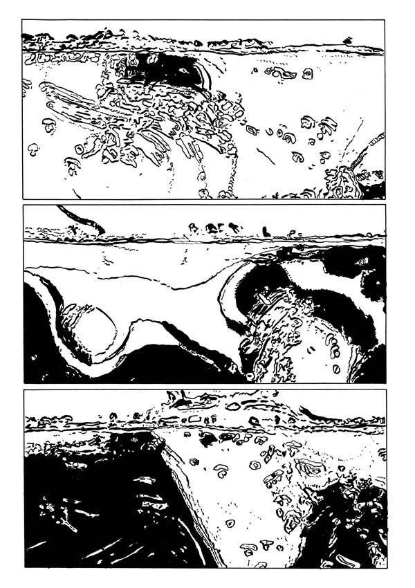
(page 3)
Here is the direct link to the pdf, but really you should explore the entire archive, beautifully curated by Derek Beaulieu. Thanks, Derek!
EDIT: Derek wanted the work to be presented on its own merits, with little accompanying text, a decision with which I fully agree. Nevertheless, some of you might be interested in the text that accompanied the piece when it was published in Blurred Vision 4, in 2008. The editor, Kevin Mutch, asked all contributors to write brief introductions to their pieces, and this is what I came up with:
For a while now I have been interested in the possibility of abstract comics, and especially in playing with shapes that are just under the threshold of legibility: shapes that, ideally, will suggest several representational alternatives but will not allow the reader to settle on any single interpretation. In such cases, an added title may help orient the reading, but hopefully it too will remain vague enough not to straitjacket the strip. “Expedition to the Interior” is an old expression, often encountered, for example, in nineteenth-century reports to the Royal Geographic Society, denoting the exploration of previously uncharted lands, far from the well-known coastlines—lands such as the Congo, the Amazon forest, or the central territories of Australia. Alternately, it could also refer to a journey to the center of the earth, perhaps one of the Jules Verne sort. Additionally, I hope the word “Expedition” will retain here its military resonance.
I had already penciled the strip and was inking the second or third page when I realized that I was channeling—or, to sound more modest, maybe I should say “imitating,” or “inspired by”—Mike Royer inking Jack Kirby. The further pages—which I inked in order—show the direct influence of these two great artists, and it may be that from the very beginning, albeit unconsciously, I was following in my own way their example.
Abstract comics, if they do nothing else, can show us that, beyond the storyline, comics also lead the reader from one panel to the next, from one page to the next, by virtue of a formal force that I would dub “sequential energy.” Kirby’s work—as well as Steve Ditko’s—par excellence displays such energy, which may lie at the very essence of what the medium of comics is. I’d like to think that all I have done here is to foreground this force, in the absence of any words, plot, or recognizable characters or settings.
(page 3)
Here is the direct link to the pdf, but really you should explore the entire archive, beautifully curated by Derek Beaulieu. Thanks, Derek!
EDIT: Derek wanted the work to be presented on its own merits, with little accompanying text, a decision with which I fully agree. Nevertheless, some of you might be interested in the text that accompanied the piece when it was published in Blurred Vision 4, in 2008. The editor, Kevin Mutch, asked all contributors to write brief introductions to their pieces, and this is what I came up with:
For a while now I have been interested in the possibility of abstract comics, and especially in playing with shapes that are just under the threshold of legibility: shapes that, ideally, will suggest several representational alternatives but will not allow the reader to settle on any single interpretation. In such cases, an added title may help orient the reading, but hopefully it too will remain vague enough not to straitjacket the strip. “Expedition to the Interior” is an old expression, often encountered, for example, in nineteenth-century reports to the Royal Geographic Society, denoting the exploration of previously uncharted lands, far from the well-known coastlines—lands such as the Congo, the Amazon forest, or the central territories of Australia. Alternately, it could also refer to a journey to the center of the earth, perhaps one of the Jules Verne sort. Additionally, I hope the word “Expedition” will retain here its military resonance.
I had already penciled the strip and was inking the second or third page when I realized that I was channeling—or, to sound more modest, maybe I should say “imitating,” or “inspired by”—Mike Royer inking Jack Kirby. The further pages—which I inked in order—show the direct influence of these two great artists, and it may be that from the very beginning, albeit unconsciously, I was following in my own way their example.
Abstract comics, if they do nothing else, can show us that, beyond the storyline, comics also lead the reader from one panel to the next, from one page to the next, by virtue of a formal force that I would dub “sequential energy.” Kirby’s work—as well as Steve Ditko’s—par excellence displays such energy, which may lie at the very essence of what the medium of comics is. I’d like to think that all I have done here is to foreground this force, in the absence of any words, plot, or recognizable characters or settings.
Monday, March 18, 2019
"Enough", Mark Staff Brandl Painting Installation Comic

A semi-abstract, painting-installation-comic in an outdoor exhibition space in St.Gallen Switzerland. Titled Enough,
it is my “anti-animal-factory” work. The pink one appears totally
abstract, but is a realistic painting, but enlarged, of ground pork. The
yellowish painting is sequential of someone walking away, an homage to a
sequence by Steve Ditko I did upon receiving the news of his death. On
the floor are about 100 sausage plates, with pigs painted on them as
they really are stuffed together in those horror “farms.” More Details
and site shots.


Monday, February 18, 2013
Abstract Horror Comix by Mayhem
I have been viewing horror and mystery comics
from 1955 through 1963. I have been mostly interested in the art of Steve
Ditko. Looking up close at the inking and the faces, a whole abstract
world started to develop. They inspired these spreads from my new
project.


Tuesday, January 13, 2015
Dusted-off Intercorstal

I started this page in September, but only picked it up and finished it off in the past few days. It uses the page layout and a very select range of elements from Amazing Spider-man #32, originally by Ditko, although I imagine you'd be hard-pressed to guess that based solely on what I've provided above.
Subscribe to:
Posts (Atom)