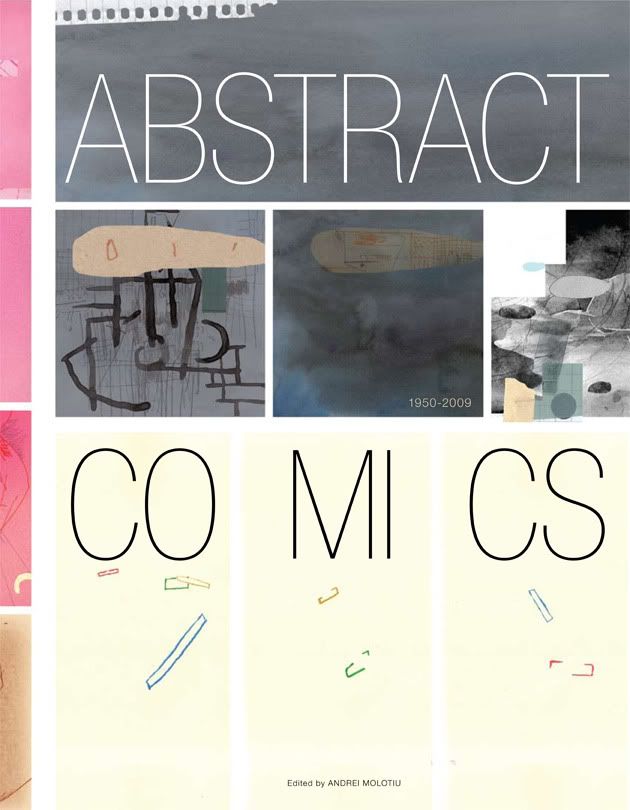
To celebrate, here is an image you will not see anywhere else. When designing the cover, Jacob "resident design genius" Covey came up with two possibilities. We picked one (obviously!). Here's the one we didn't pick--which is still pretty great too:

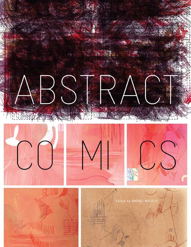
Of course, if you go to the comic-book shop to look for that cover, you won't find it--so, to remind you (and for comparison purposes), here's what the actual cover looks like (yes, I know, posted here for the millionth time):

Which one would you have picked?

The alternate one looks to be unfinished, in progress grey too.
ReplyDeleteThis published one is a triumph. Wonder how it would play with txt of "ab cmx".
The colouring of black and red and white is similar to stripgenerator.com, which is a plus.
One of my friend in Montreal have see the book at his library : nice work and great book !
ReplyDeleteI love first covers too.
ReplyDeleteIt's interesting to see the other cover but I really love the final.
ReplyDeleteI'm into everything I've seen Jacob Covey design but this one has something special to it - maybe just because he was using abstract imagery - so it was an opportunity to put the emphasis on the design itself.
Everyone I show it to says, "Great design!" - even people who don't normally consider such things.
It would be great to see it go up for some awards.
I'm on both covers - SO THEY ARE BOTH GREAT! ha ha
ReplyDeletesecond
ReplyDeletethis book's concept itself was quite inspiring.
ReplyDeletehttp://swellzombie.blogspot.com/2009/08/weekly-071.html
Thanks.
I think the final one was definitely the one to go for, although there is an interesting minimalism to the original cover.
ReplyDeleteGreat job anyway. I look forward to finally seeing it in the flesh.
All the best,
Dick W.