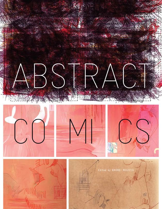
Please note that the font for the title has been changed slightly from the earlier version I used for the blog banner. As Jacob himself admits, he stays up late at night obsessing about such things.
looking closer at the font, it's amazing in typography how the most subtle of changes can have such profound impact
the R in particular & how the curly version kind of clashed with the straight descender of the A, & just that slight spinal alignment straightening the C gives a certain uprightness to match up well with the panel which it is within.
The first and most comprehensive source of abstract comics on the web, tracing the history and surveying the contemporary landscape of abstract sequential art.
On Abstract Comics: The Anthology (Currently SOLD OUT):
The artists assembled by Andrei Molotiu for his anthology ABSTRACT COMICS (Fantagraphics, $39.99) push “cartooning” to its limits... It’s a fascinating book to stare at, and as with other kinds of abstract art, half the fun is observing your own reactions: anyone who’s used to reading more conventional sorts of comics is likely to reflexively impose narrative on these abstractions, to figure out just what each panel has to do with the next.
--Douglas Wolk, New York Times Book Review, Holiday Books edition, December 6, 2009 The collection has a wealth of rewarding material... it is a significant historical document that may jump-start an actual new genre.
--Doug Harvey, LA Weekly It becomes a treat to take a page of art - or a simple panel - and consider how the shapes, texture, depth, and color interact with one another; to reflect on how, when one takes the time, the enjoyment one ordinarily finds in reading a purely textually-oriented, narrative-driven written story can - with the graphic form - be translated into something completely different.
--Adam Waterreus, Politics and Prose, "Favorite Graphic Literature of the Year."
...this arresting book is like a scoop of primordial narrative, representational mud. Which is to say, it has vitaminic powers.
--Design Observer
For years, comics (at least American ones) have doggedly refused for one reason or another, to consider other schools of art and beyond mere representation. It's only now we see artists attempting to branch out and try to push at the edge's of the medium's definition. As such I found Abstract Comics to be a revealing, thought-provoking and genuinely lovely book that I'll be sure to be rereading in the months to come.

wow, a beautiful sight!
ReplyDeletejust perfect really.
& yes, the kerning does look better with this version, actually more legible & balanced.
big ups to Jacob!!!!
looking closer at the font, it's amazing in typography how the most subtle of changes can have such profound impact
ReplyDeletethe R in particular & how the curly version kind of clashed with the straight descender of the A, & just that slight spinal alignment straightening the C gives a certain uprightness to match up well with the panel which it is within.
goodstuff!
I agree, the cover is awesome! I especially like the top section with the hard black lines.
ReplyDelete